Halifax, meet Just Cycle
Just Cycle is a new spin studio that combines rigorous workouts, a luxe environment, and a supportive community to help bring fitness into your life. Delving into the idea of personal growth, we developed a strong brand identity that highlights the push and pull of high intensity and accessibility. We established the brand as both a serious work out, but not so extreme that it would deter beginner cyclists. This duality informed all branded touchpoints, from the interior signage to the website.

Branding

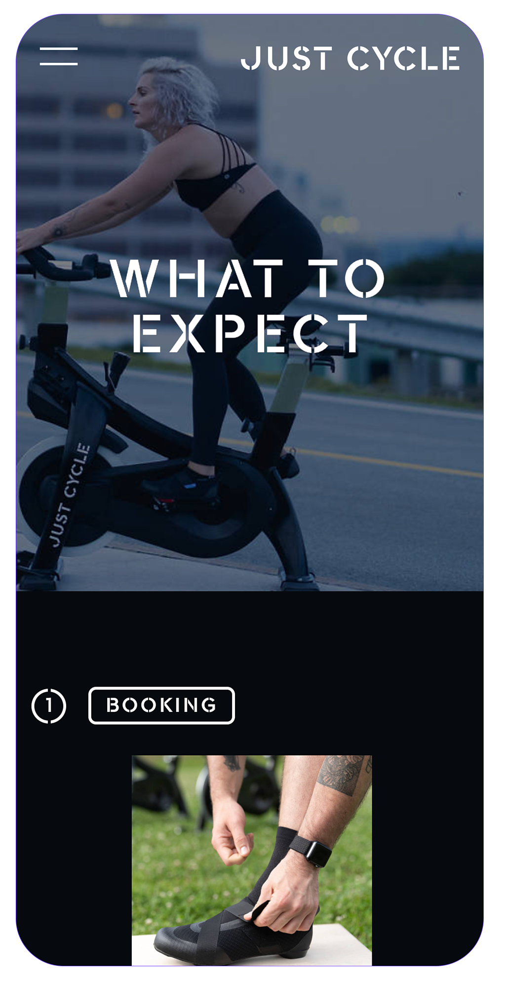
Fitness means something unique to everyone, and so the look and feel and tone of voice needed to be one of trust, acceptance, and encouragement.

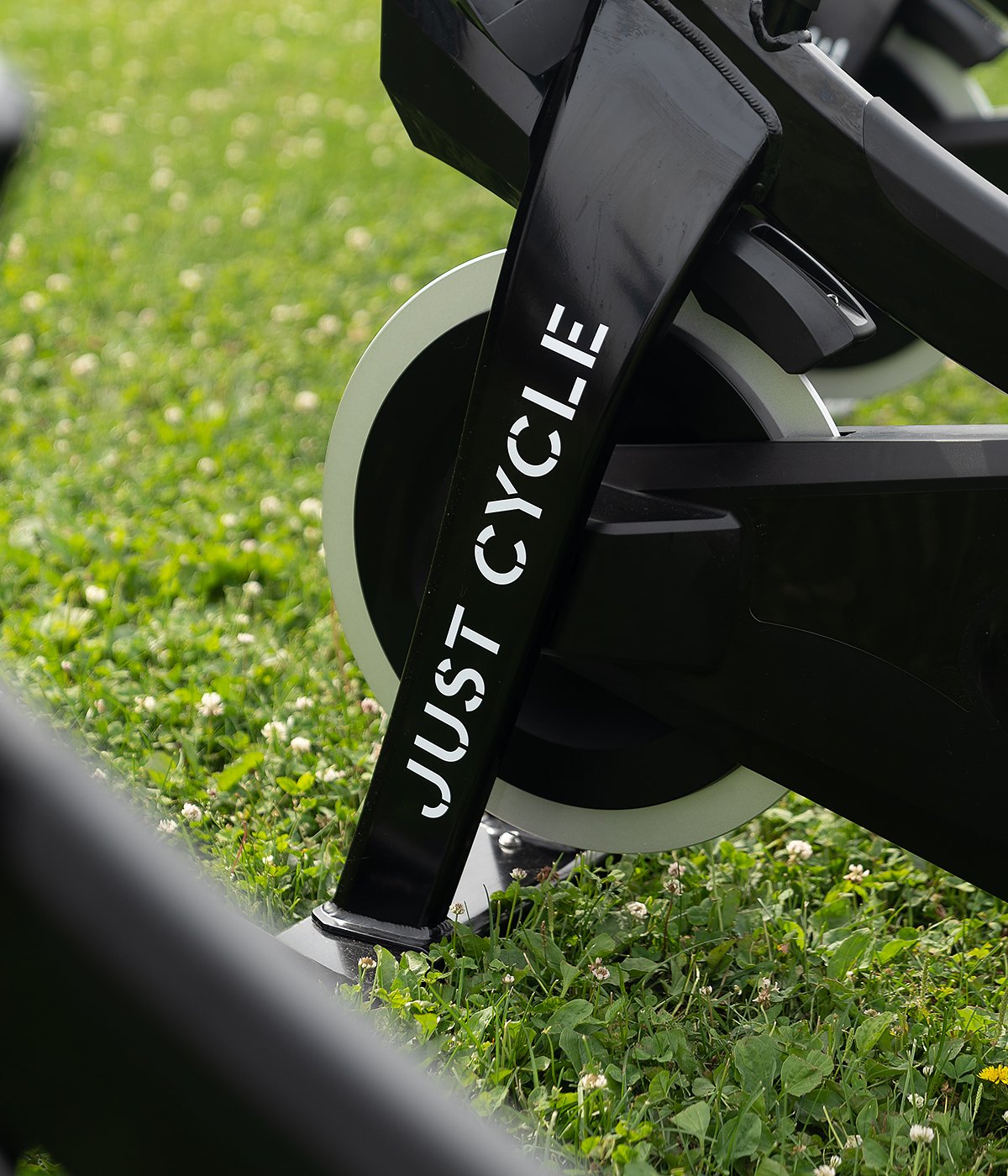
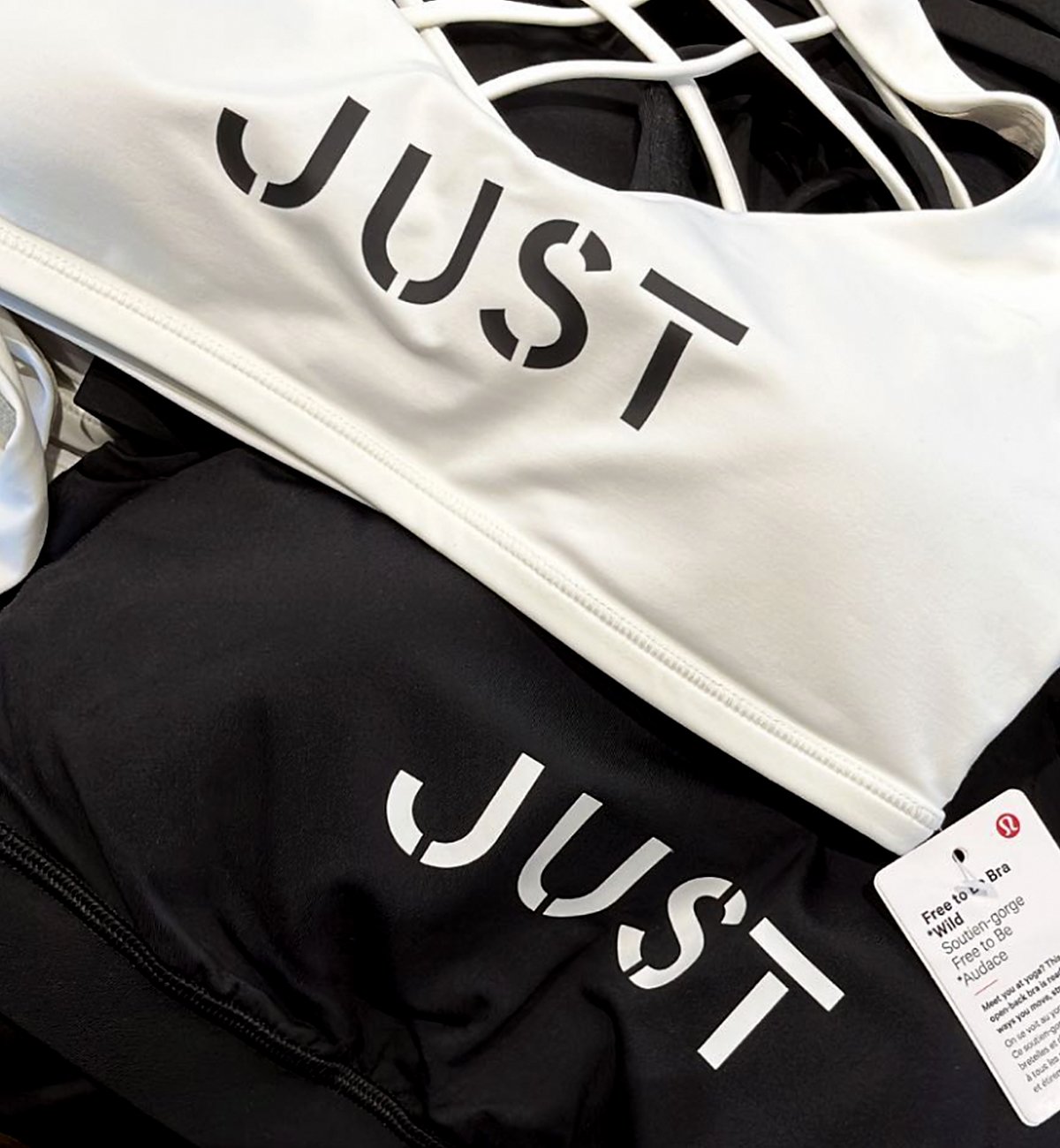
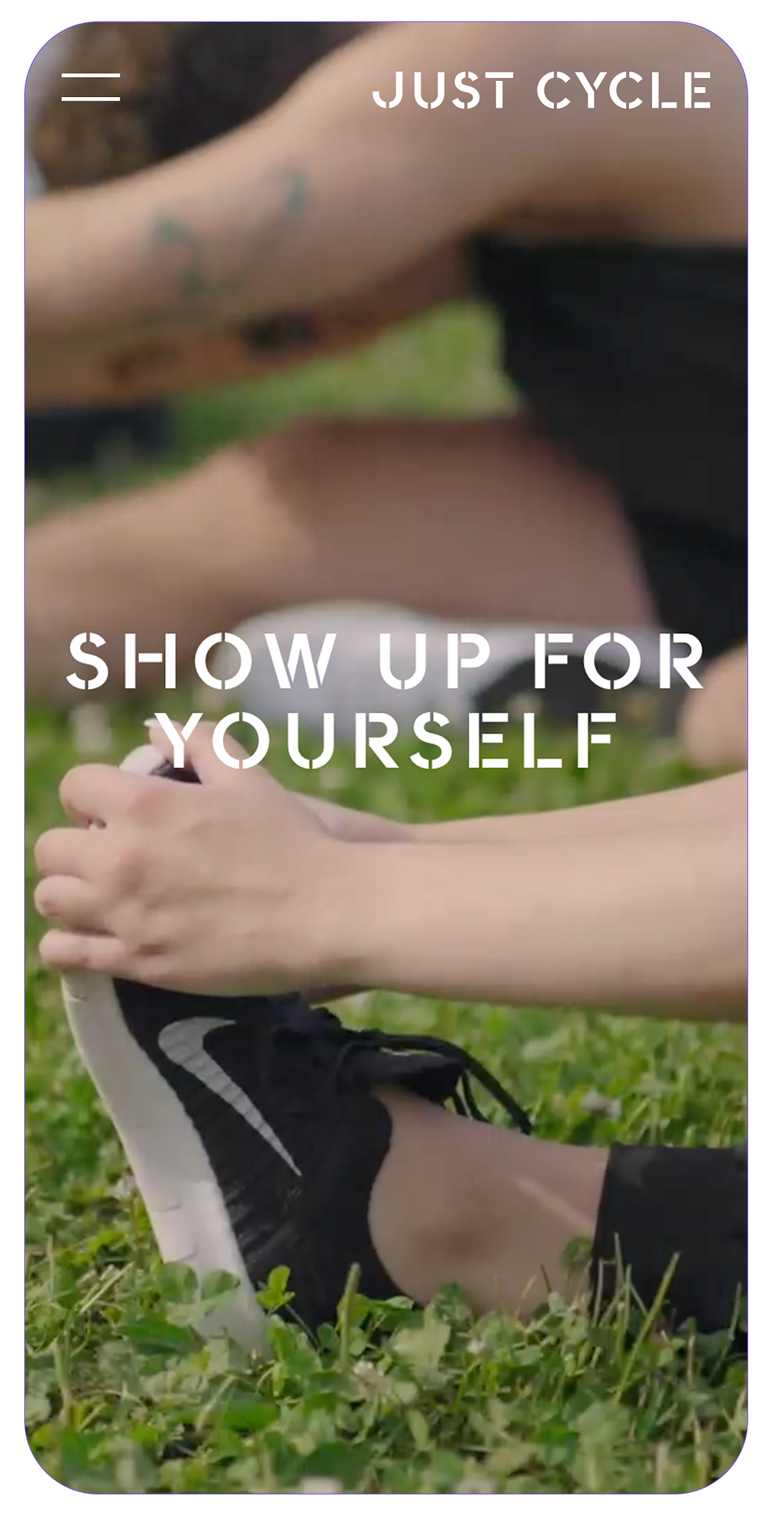
The tone of voice we developed is at once approachable but bold. Clear, friendly, and concise language is used throughout communications to connect with a wider audience. We avoided puns and jokes, and instead focused on developing a trustworthy and motivational tone of voice. In distinct brand moments, messages of encouragement and power were used, highlighting the resilient and raw spirit behind the brand, and setting up a use for the stencil display typeface.

Art Direction

Our art direction strategy also had two voices: one that highlighted the intense focus and power during a work out, and one that was more candid, natural, and welcoming and reflective of the space.

Website Design